FULLFILL
The Challenge
FULLFILL contracted the CurtDoty.co to develop a brand, interface, UX, and editorial look that would support a new twelve week weight loss program. To be released as a mobile app, it immediately competed with a slew of competitors.
How FullFill is Different
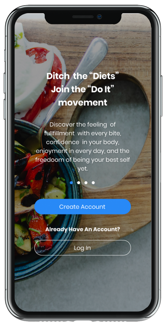
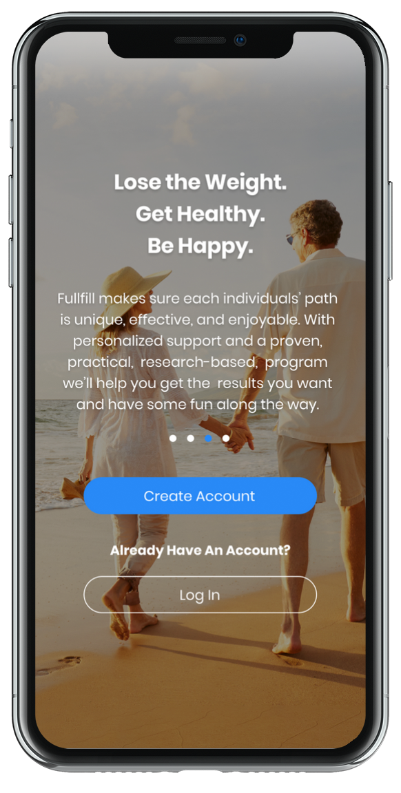
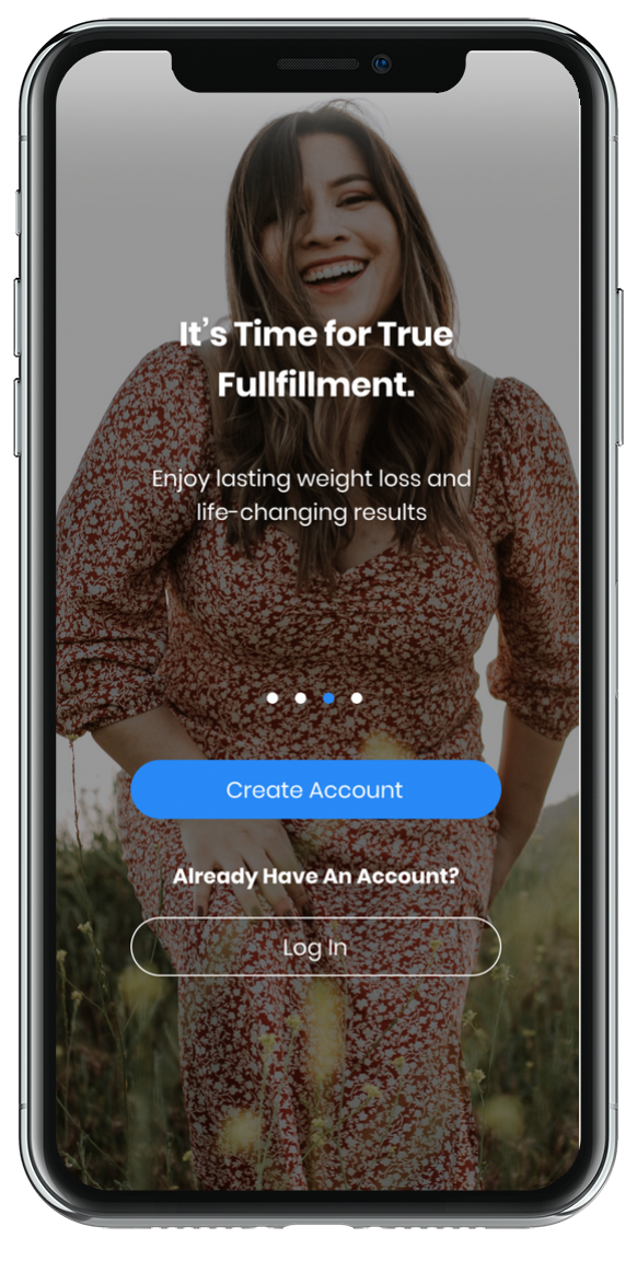
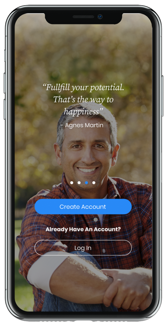
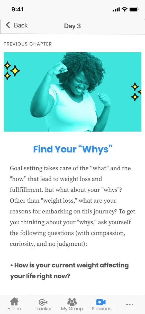
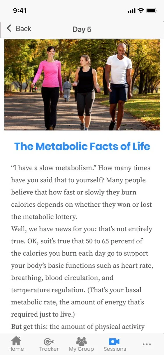
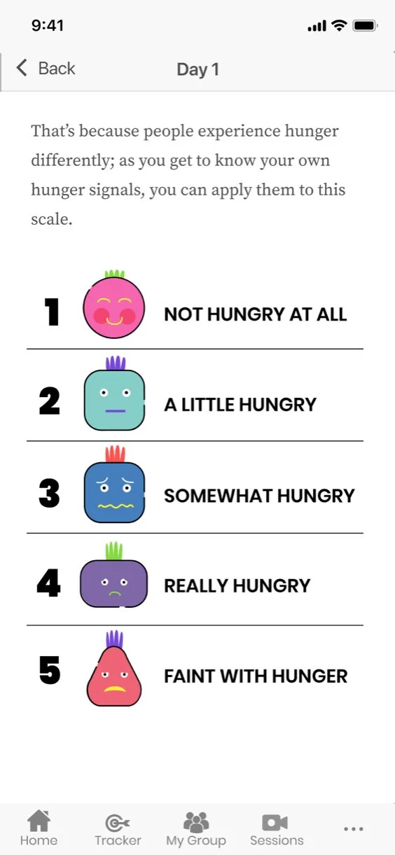
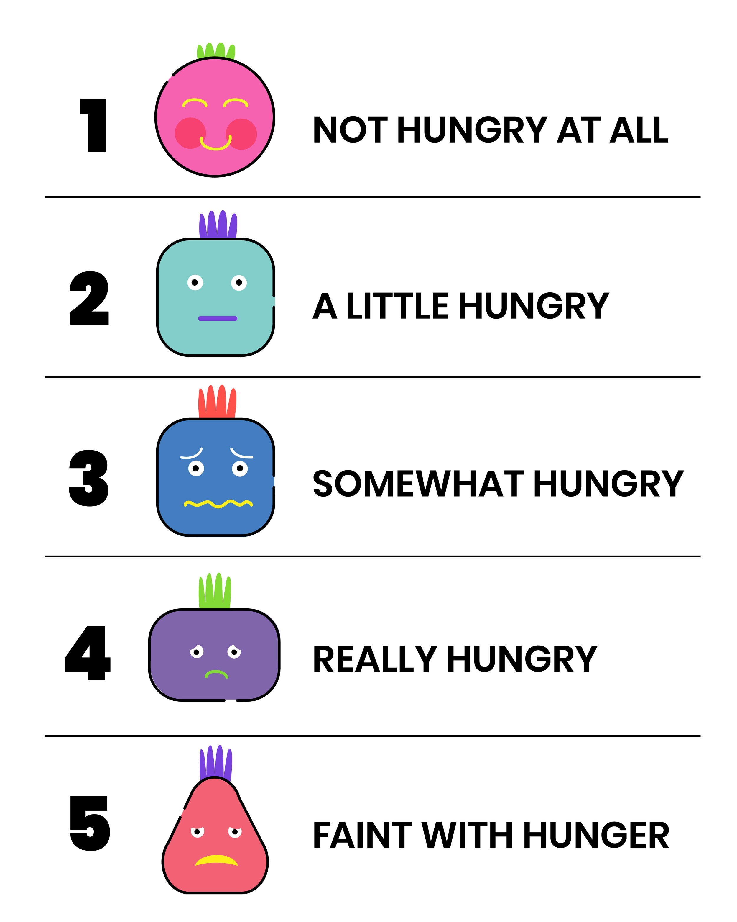
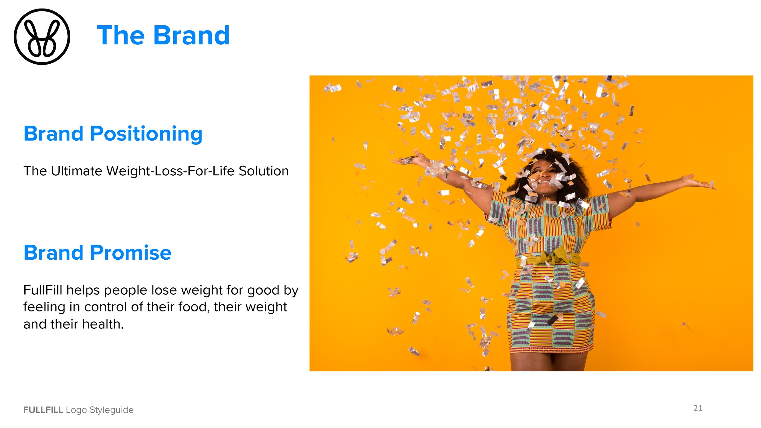
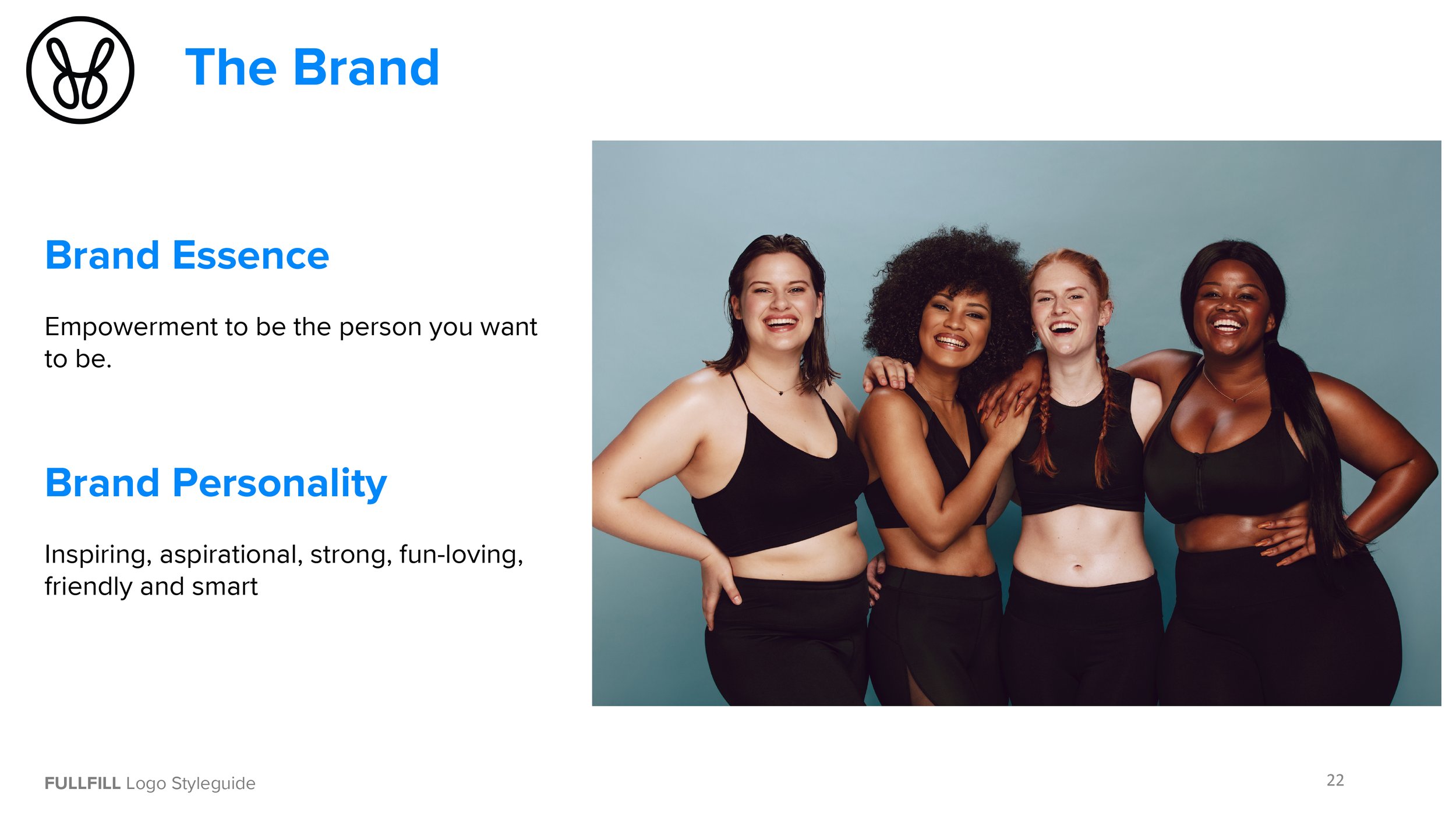
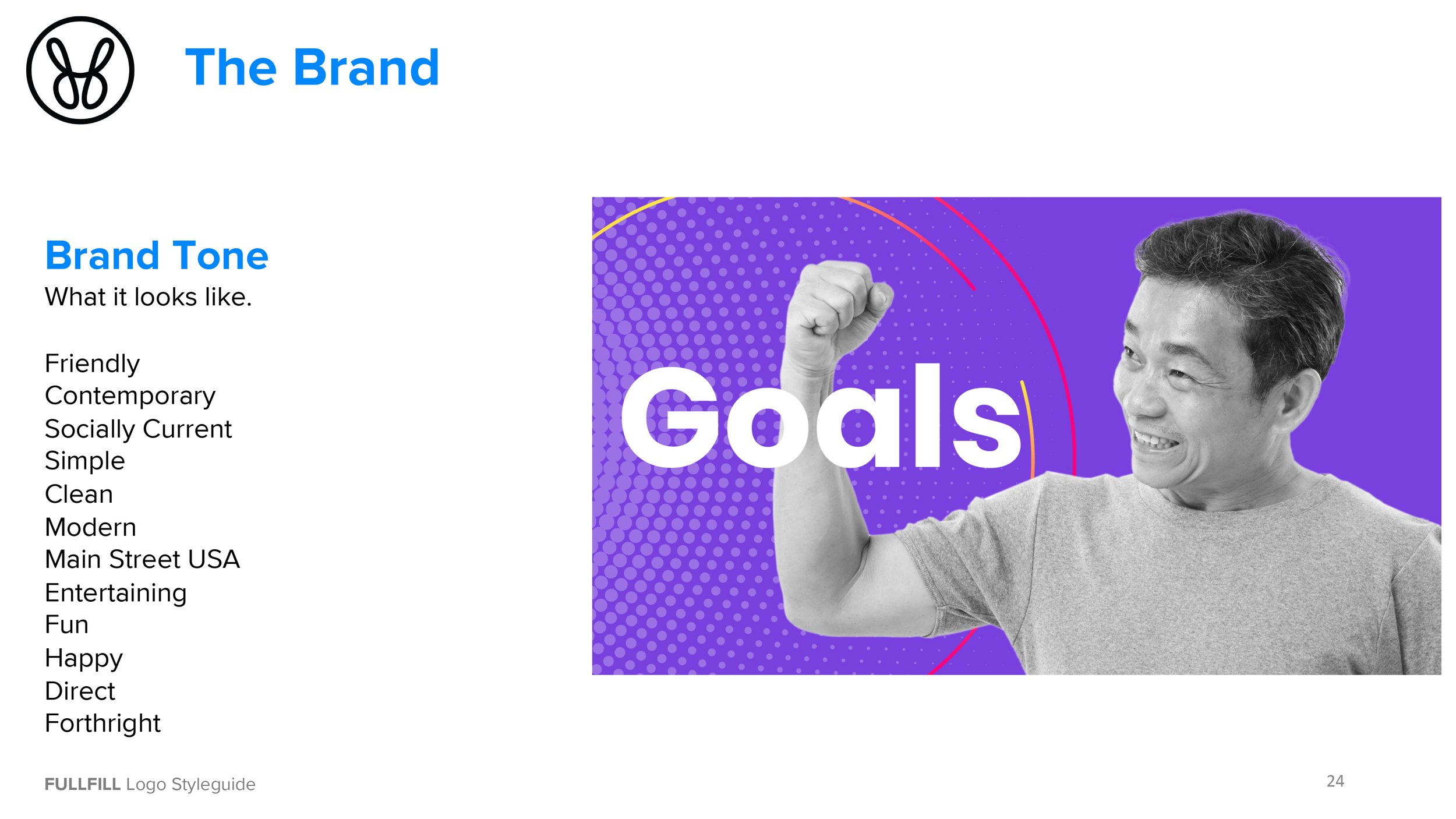
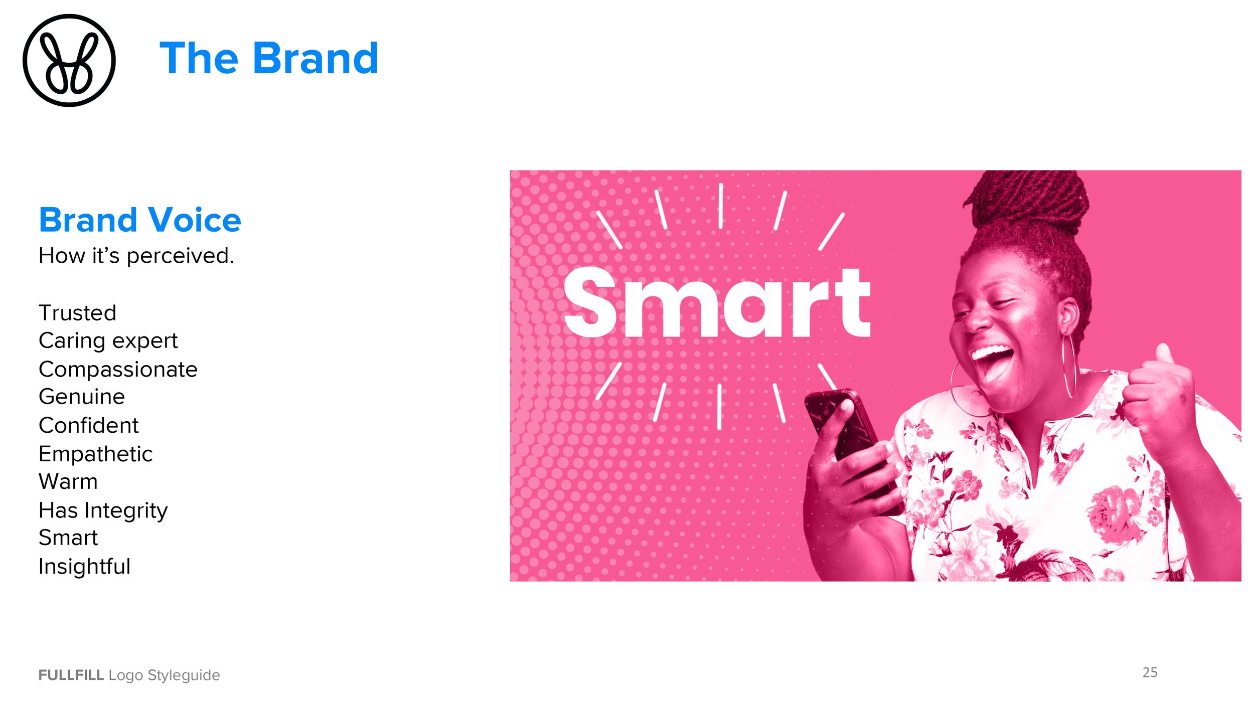
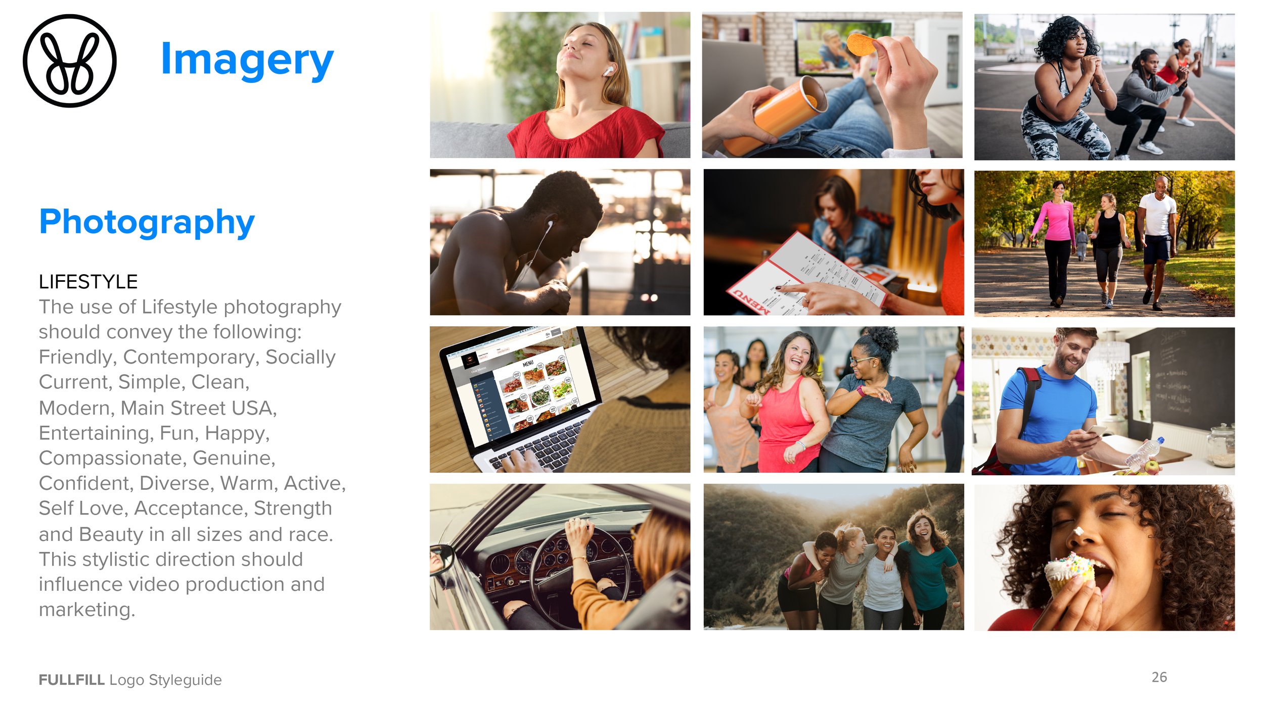
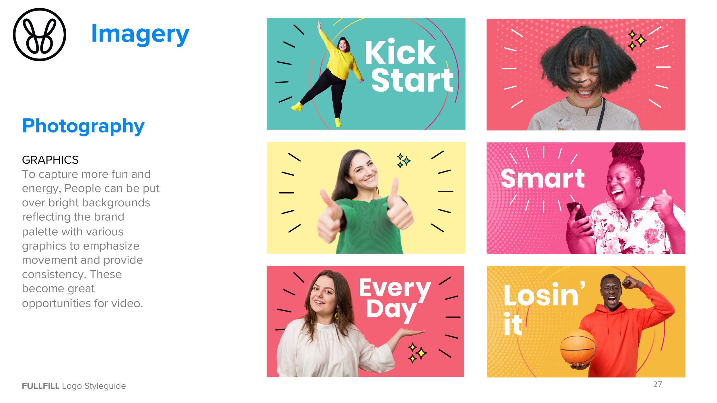
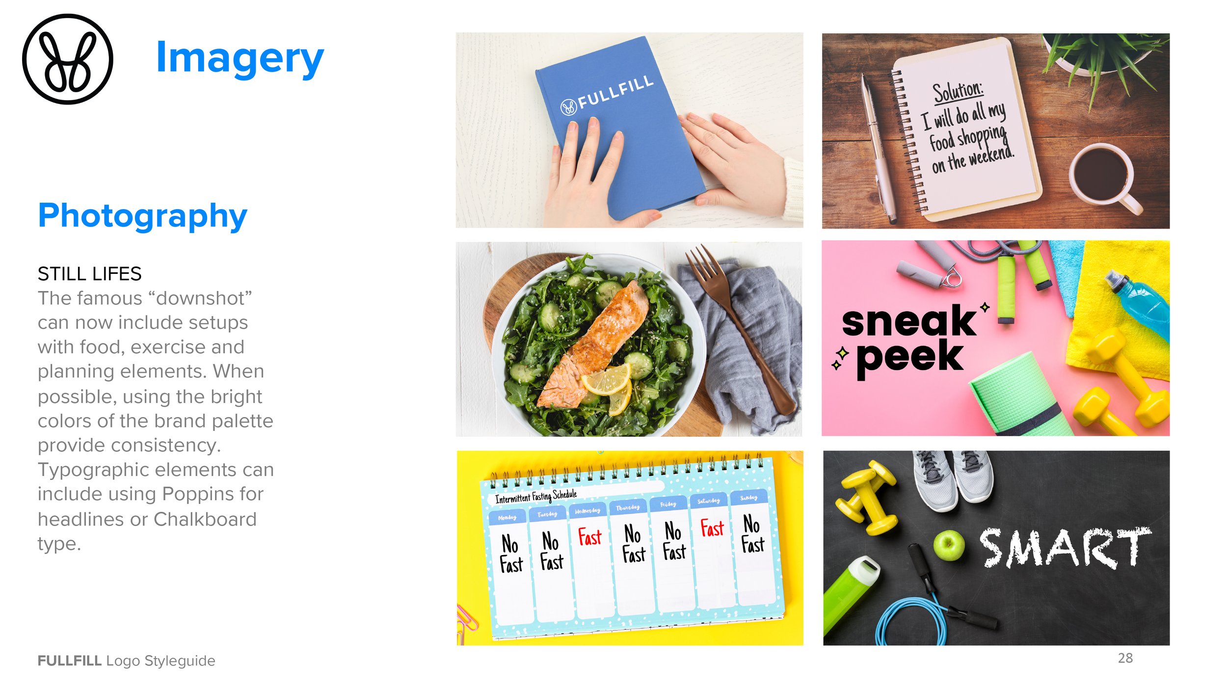
FULLFILL takes a human approach to weight loss. Therefore all the imagery used is relatable, attainable and presented positively. A well written program that helps you along the way with tips, guidance and encouragement.
Branding
Brand Positioning
The Ultimate Weight-Loss-For-Life Solution
Brand Promise
FullFill helps people lose weight for good by feeling in control of their food, their weight and their health.
Brand Essence
Empowerment to be the person you want to be.
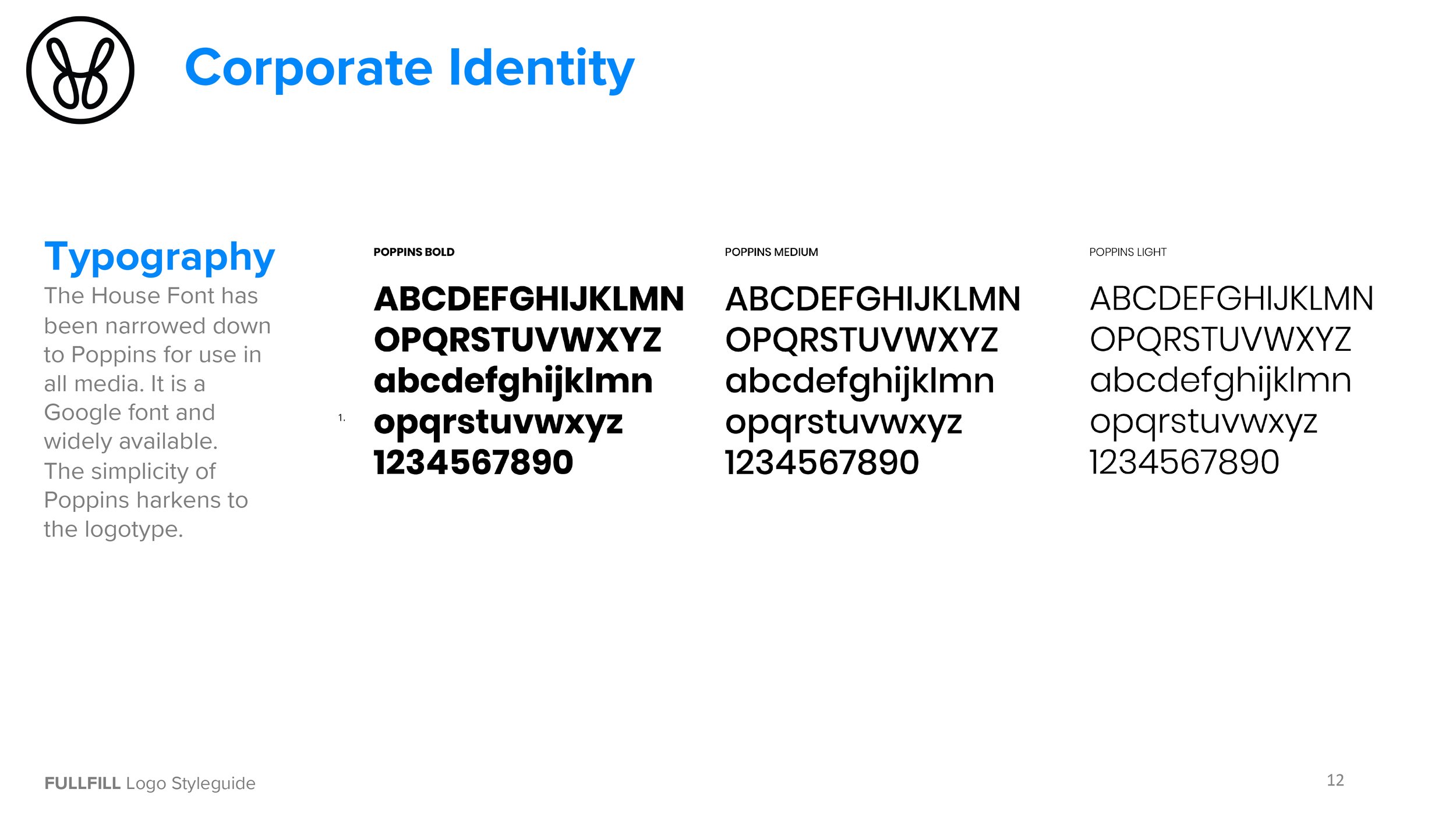
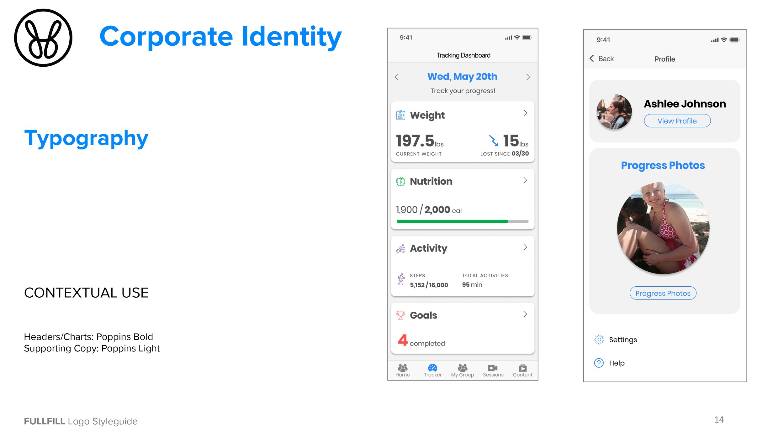
Corporate Identity
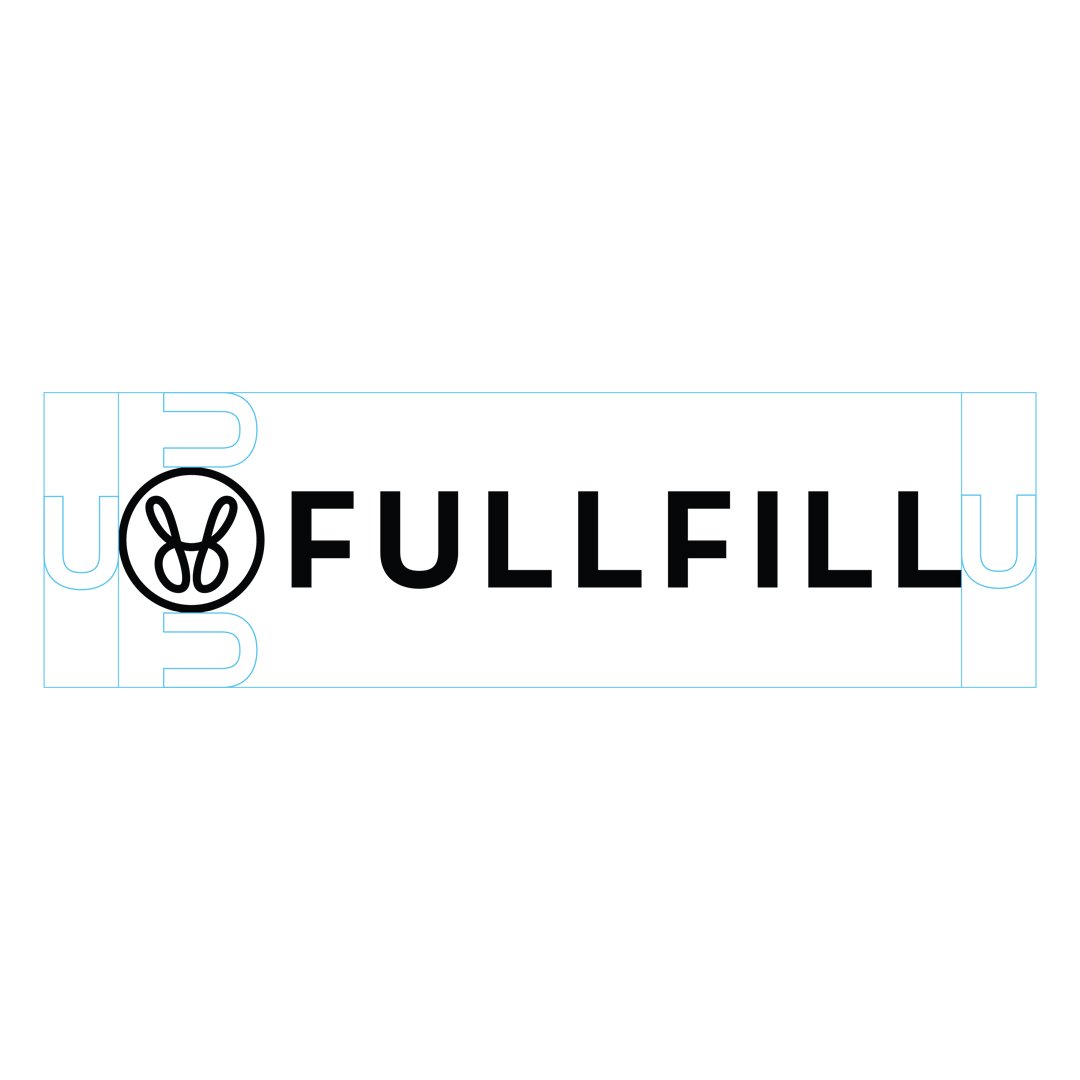
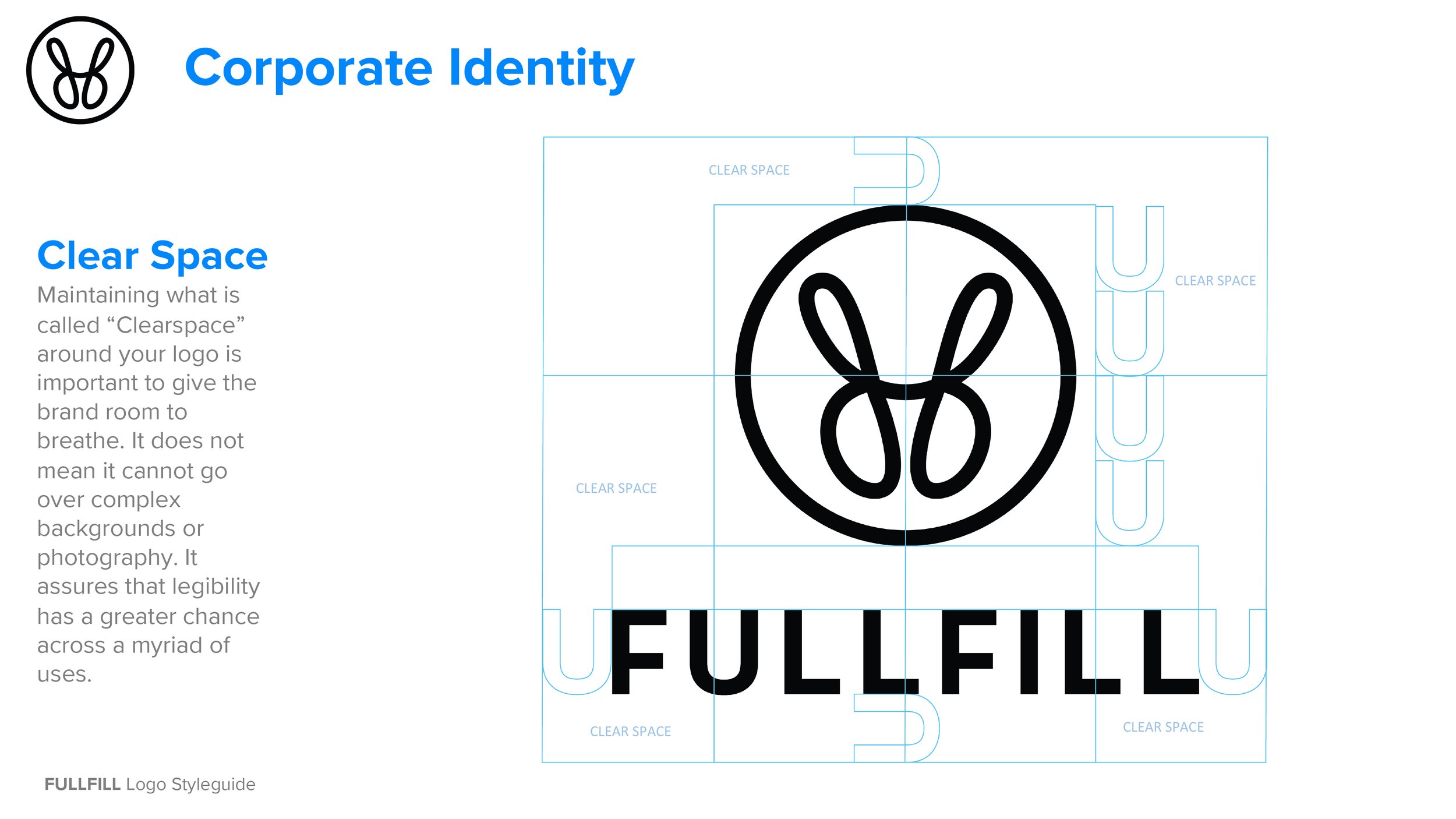
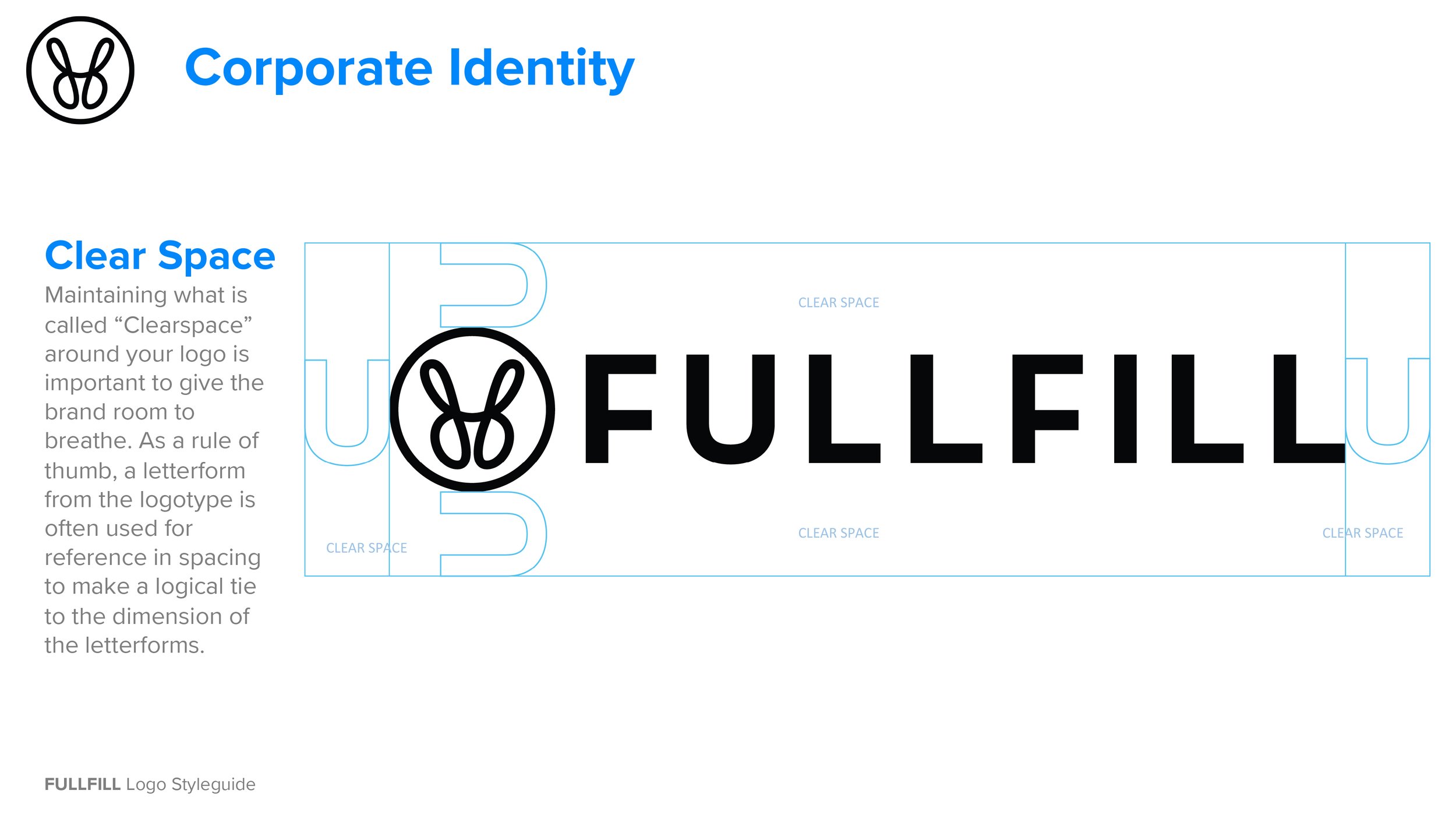
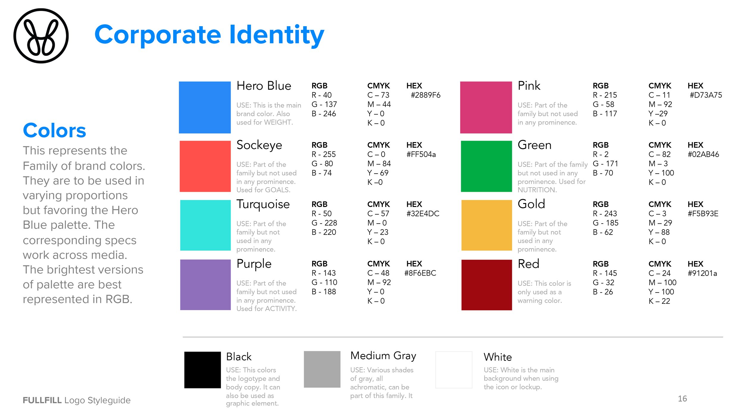
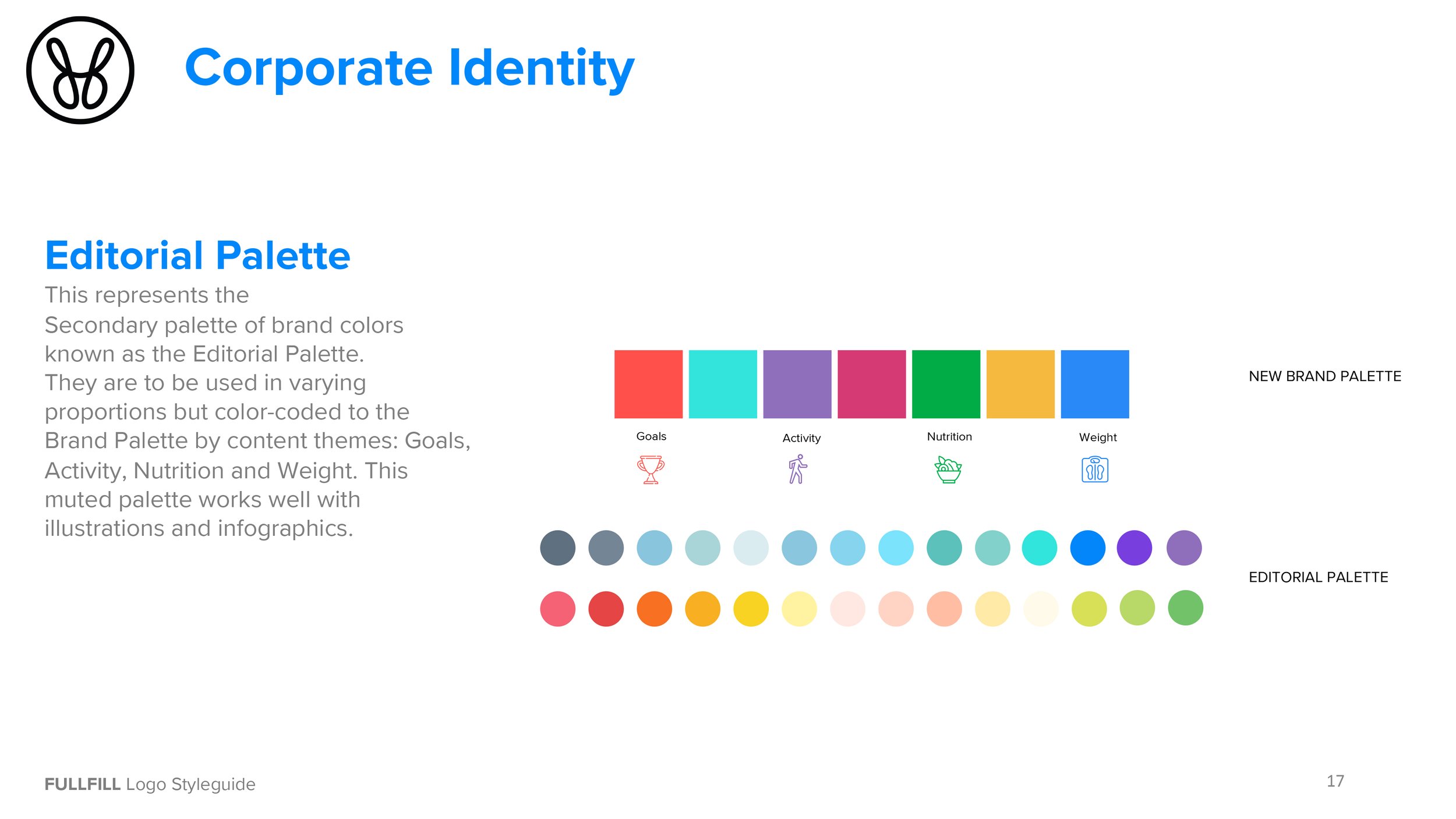
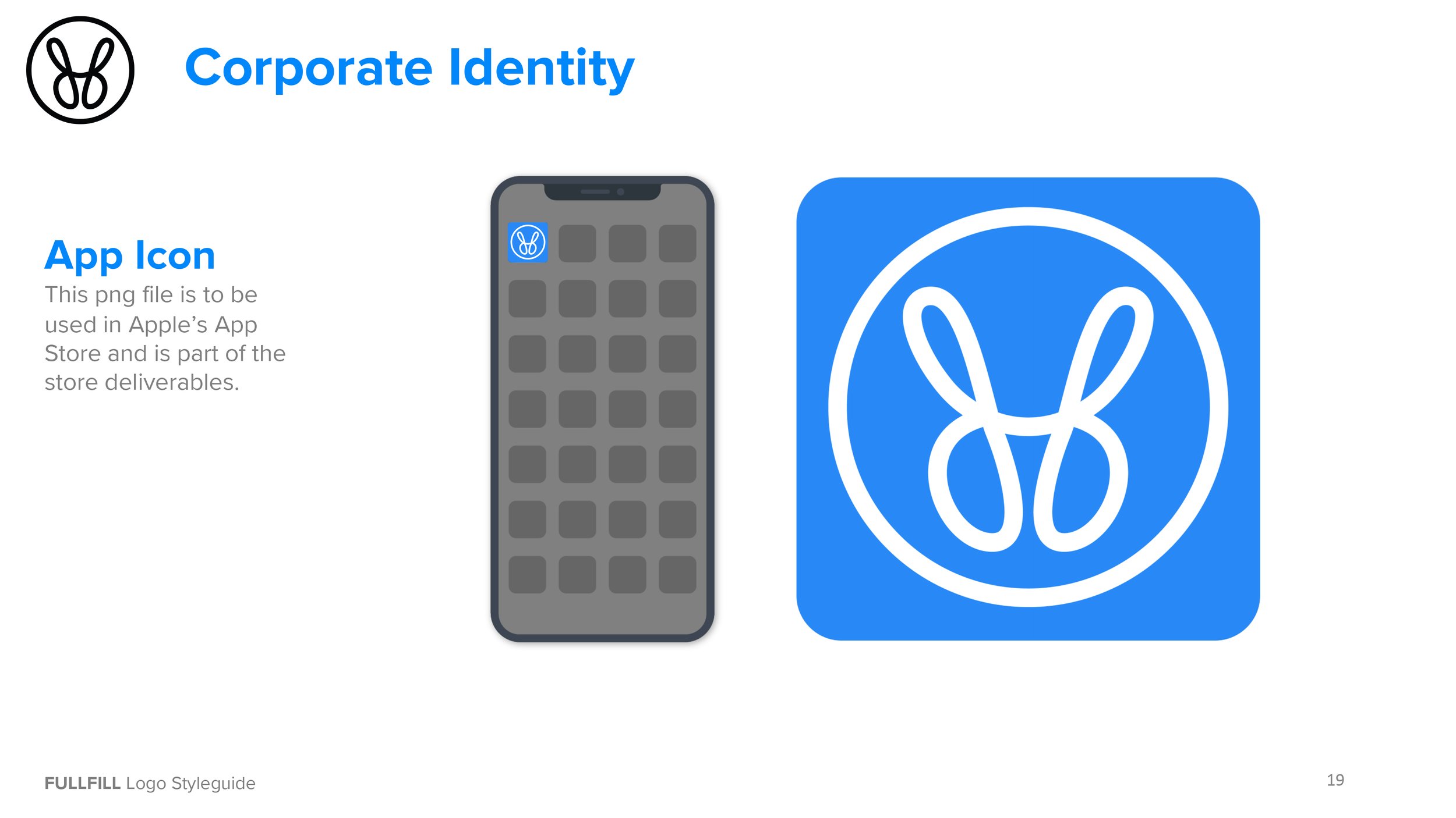
Representing FREEDOM, We used the framework of the letter “f” from the word Fullfill, the icon stand for freedom and fulfillment. The metaphor of a butterfly symbolizes transformation. A sophisticated palette signifies an exciting and electric brand.
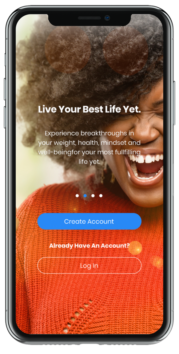
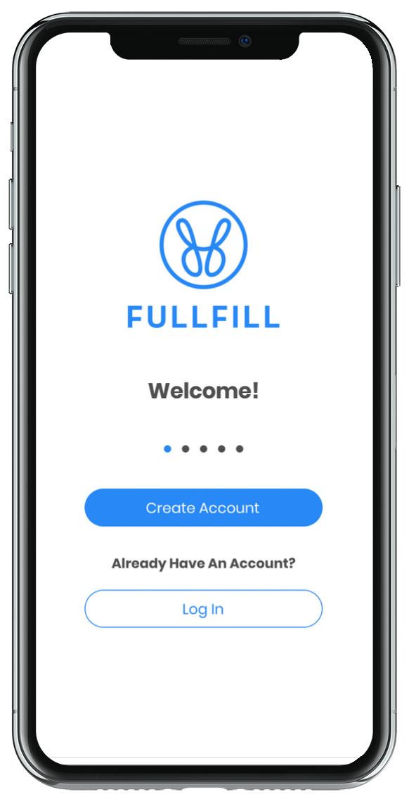
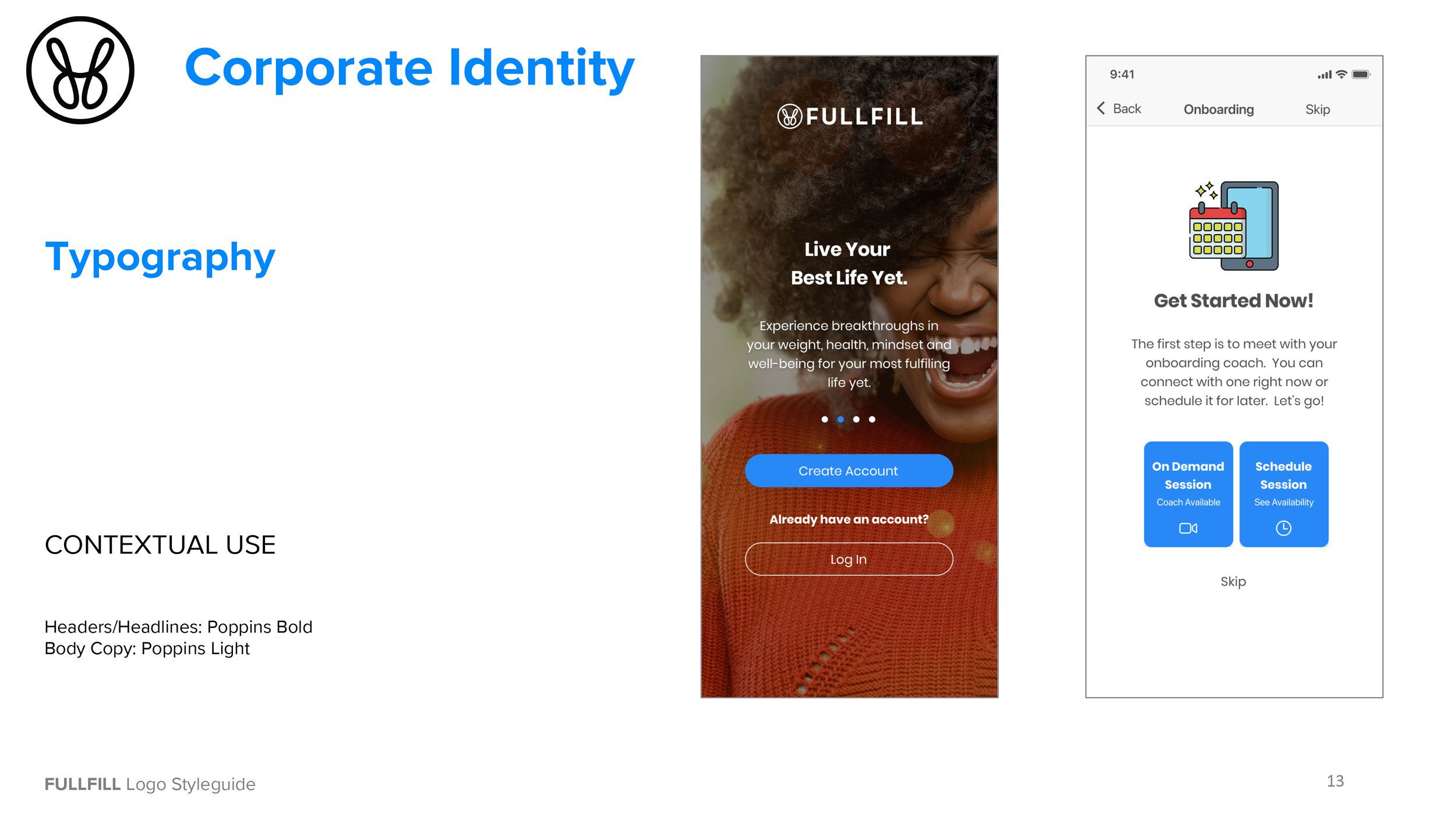
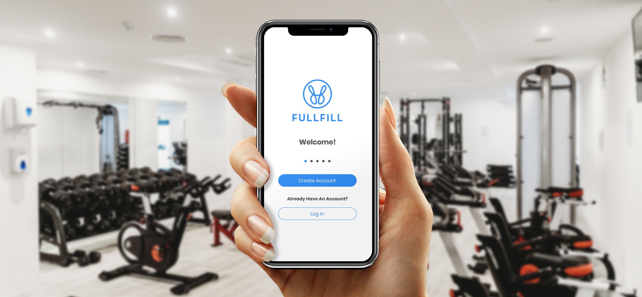
Onboarding Screens
“Curt is the consummate professional and an absolute pleasure to work with. He is current on the latest market trends and consumer expectations and combines that with his years of experience to provide effective solutions and strategies. Most notably, his collaborative style and his ability to meet his clients at their level combined with his focus on the project’s objectives makes him an extremely effective manager. I look forward to the next opportunity to work with him on a project.”
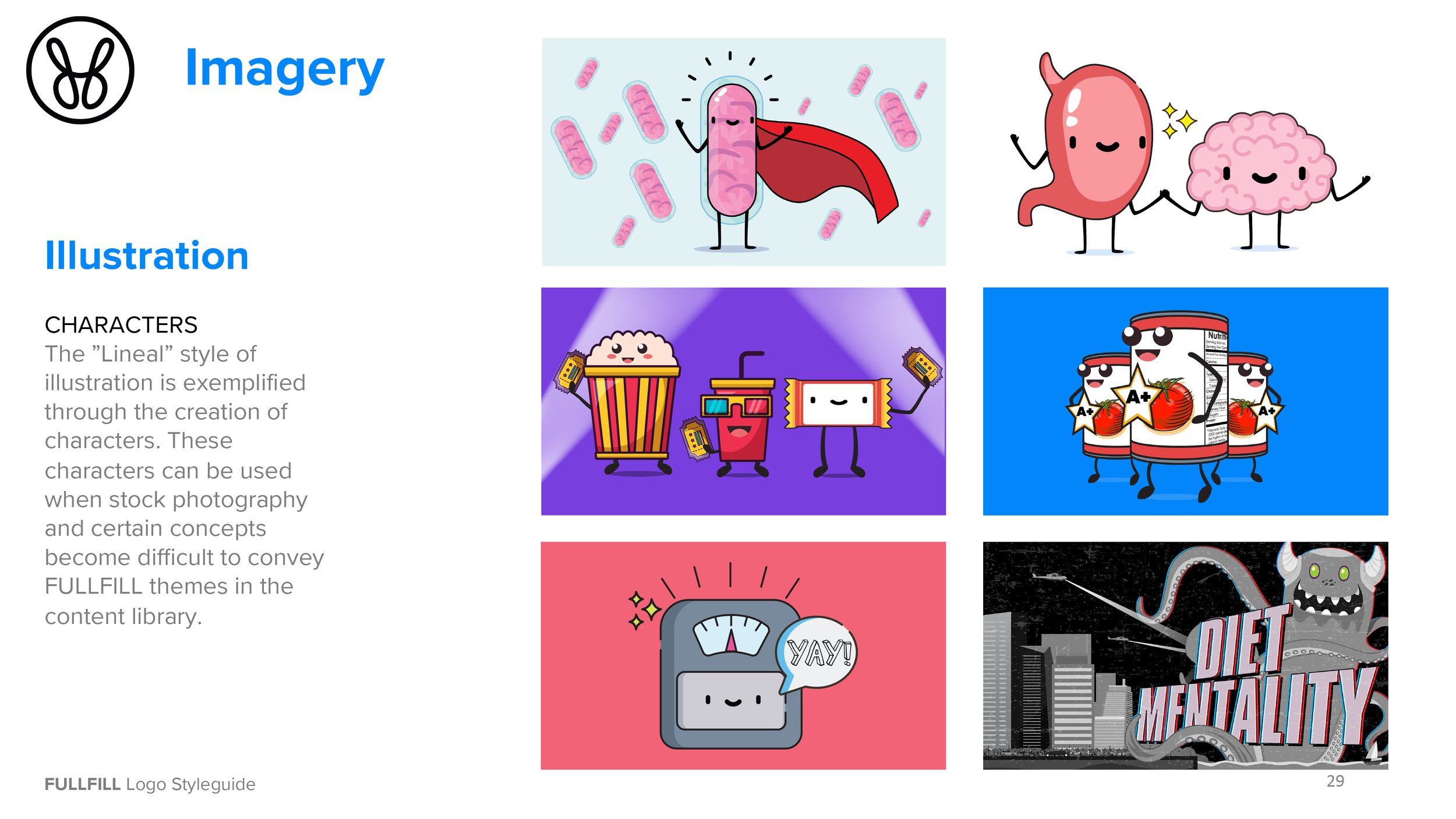
The Illustrated Brand
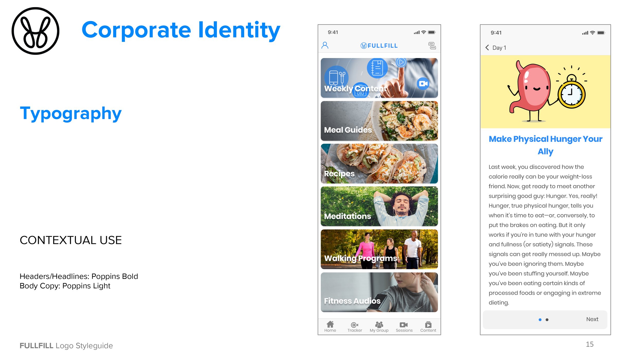
Program Editorial
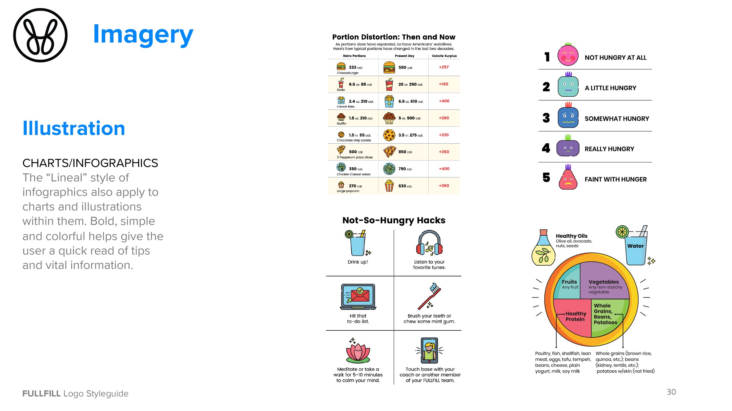
Infographic Style
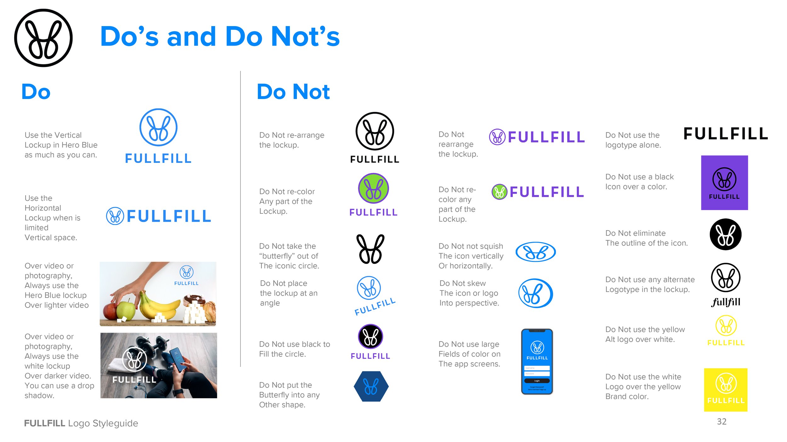
Brand Styleguide
Special Thanks
Peyman Dadmehr
Lauren Murphy
Shelley Lindenfelser
Natalie Barandes
Danny Tubbs
Noah Tubbs
Debra White Doty
Tiffany Olay
Melisa Anselmo
White Prompt
more startup case studies






ADDENDUM
If you need this type of consulting for your Startup, contact my paid consultancy. Click Here.
Looking to learn how to PIVOT your company for growth? Click Here.


